The update coming to Google's algorithm on April 21st for determining if a website is mobile friendly or not isn't the only reason you should be looking for website usability testing tools. Jakob Neilsen, an expert in the field of web usability, states that usability includes "learnability, efficiency, memorability, errors, and satisfaction." In short, if a user doesn't like the functionality of your website, they are going to bounce. Because functionality is one of the largest contributors to website bounce rates, you will want to at least do some usability testing to make sure your visitors are able to navigate your website with ease.
When it comes to website usability, or just about anything on the web, data is king. The more data you have, the more informed your decisions will be. The tools mentioned in this post are completely free, have a free-trial period, or run on a 'freemium' model that gives you a baseline amount of testing for free so you can compile the most data you can about how users interact with your website on a budget. Don't forget to click the screenshots of a tool to check out their website.
MOBILE USABILITY TESTING TOOLS
Because of the upcoming update to the way Google will index mobile-friendly and non-mobile-friendly websites, mobile usability testing tools seems like the best place to start.
UXCAM
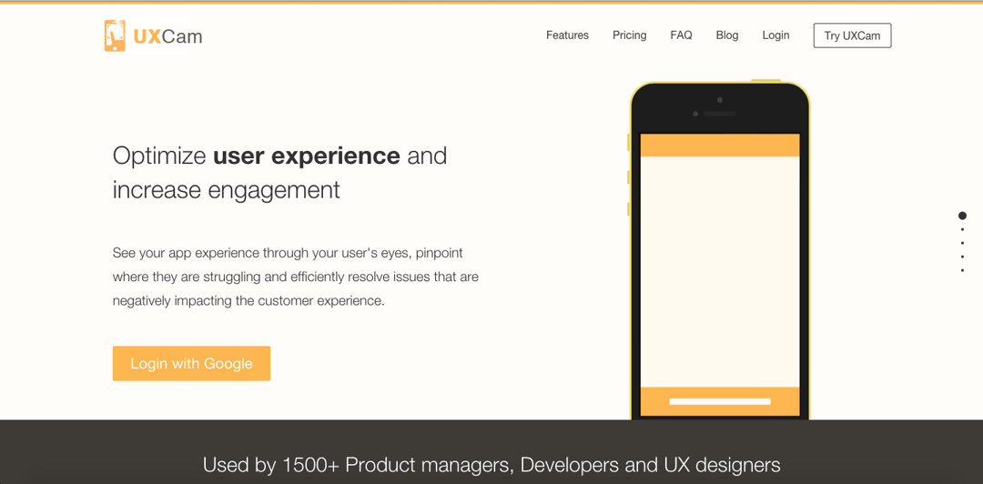
UXCam lets you watch videos of your users interacting with your app. Two lines of code and less than two minutes of integration that's what UXCam is all about. Available for both Android and iOS, UXCAM is a game changer, with features that†record all events in your app, providing insights into user behavior and helping you solve problems that users encounter.
UXCam is free to use for up to 100 video recordings. Anything more than that and you will have to pay. When testing, screen, and camera recording count as one video each. For instance, a session with both screen and camera recordings will have two videos counted.
Why You Would Use This: The UXCam platform captures user-experience data and visualizes this data so you can understand how to improve the UX of your app/website. It is an SDK (software development kit) that runs in the background of your app and captures user-experience data, records what's happening on-screen, and optionally, when useful, it captures your user's emotions with a face video - with the consent of both the developer and the user.
Capturing facial expressions is an incredible testing tool that isn't offered by many others, if any. Understanding your users' emotional reactions and thoughts is an unbelievably useful piece of data.
SETTING UP UXCAM
UXCam isn't about the design necessarily, it's about giving you the data you need to create a better user experience on a mobile device. UXCam has developed excellent documentation on how to set up the tool. So, if this is the user testing tool for you, check out the documentation.
USERZOOM
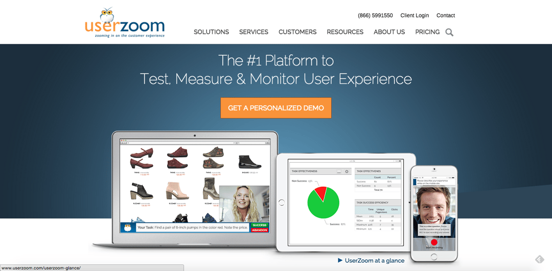
The king of usability testing tools: Userzoom. Unfortunately, this tool isn't free and doesn't operate on a freemium model. The only way you can get access to this tool for free is by requesting a free trial, which is actually a relatively new feature for them.
UserZoom offers a suite of tools to survey users that includes task-based surveys, card sorting, tree testing, screenshot click-testing, and general surveys all of which point their focus to these three major areas:
- Providing an all-under-one-roof solution for businesses
- Allowing for extensive customization of the surveys: how they look, the questions themselves, and in post-analysis
- Benchmarking through competitive analysis
Why You Would Use This: By comparison, quantitative testing can be done on the cheap, compared to other tools and vendors. They provide an excel spreadsheet of all the raw data, which UserZoom can customize for you to get what you need. Also, they have tree testing, card sorting, survey capabilities, and mobile testing.
In short, if you have a budget, go ahead and buy this one. Otherwise, it is worth a free trial to experience that data that you can have at your fingertips and see what you need and what you don't. It may turn out the UXCam or Watchsend is better suited for your needs anyhow.
SKALA PREVIEW
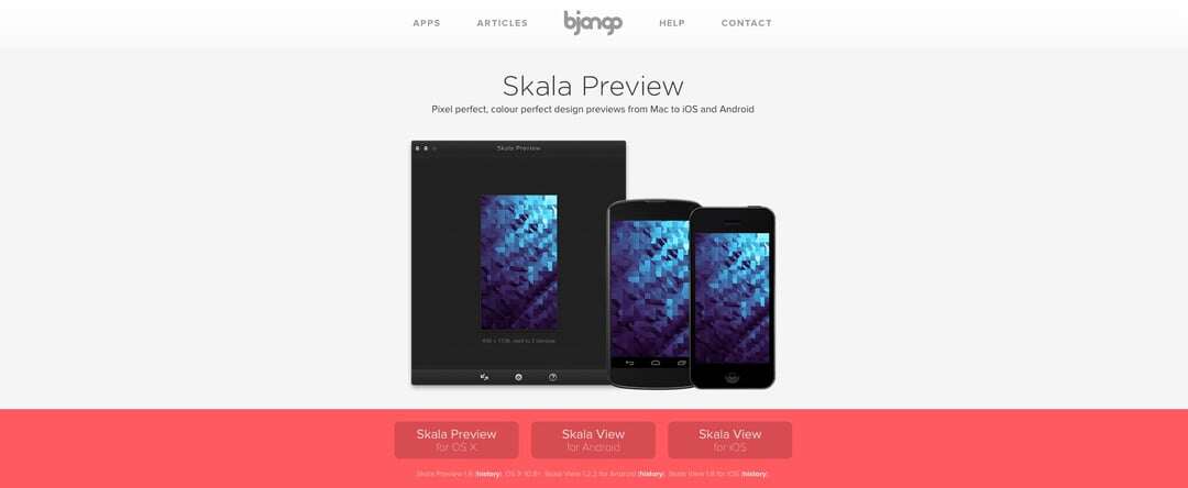
Skala is free to download in the App Store on your Mac or iOS device, as well as free to download your Android device from Google Play. However, you must have Skala Preview on your Mac and Skala View on either your iOS or Android device. So, unfortunately, if you don't have a Mac, then you're out of luck on this one.
Why You Would Use This: Skala Preview is the fastest way to send pixel-perfect, color-perfect design previews from your Mac to your iPhone or iPad. Allowing you to test tap sizes (which is a huge point of emphasis on mobile for Google) as well as text size, color, and ergonomics. All this can be done in the design phase, meaning you don't need to make live edits. It makes for a much smoother design process, leading to a better final design.
If youíre using Photoshop CS5 12.0.4 or newer, Skala Preview can preview your canvas as you edit. No saving, no keyboard shortcuts just lossless previews in real-time. It is the absolute fastest way to preview a design mock-up on an iOS device.
If you're using Fireworks, Pixelmator, Acorn, another image editor, or an older version of Photoshop, Skala Preview can send images via the clipboard or by dragging files to its dock icon or window. The clipboard is sent automatically, so you don't have to break your workflow to send. Just copy something and it will appear on your iOS device.
Send your image to as many iOS devices as youíd like. Itís even possible to view different color blindness testing, orientation, or zoom level on multiple devices at once.
CONNECTING SKALA PREVIEW AND SKALA VIEW
To make Skala work, you have to connect preview and view between your Mac and Android or iOS device. To connect and start previewing images from your Mac, launch Skala Preview on your Mac and Skala View on your iOS or Android devices. Then, tap the computer icon in Skala View to see the list of available computers. Your Mac and mobile device will need to be on the same Wi-Fi network to see each other.
Once Skala Preview and Skala View have found each other, you'll be prompted to approve the connection. This happens once for each device connected. To remove previous authorizations, choose Reset All Authorizations from the Settings menu. Doing so will mean connecting devices will have to be approved again.
If you can, using Skala Preview with iOS Personal Hotspot via USB is a fast and reliable way to work.
ADOBE EDGE INSPECT (SHADOW)
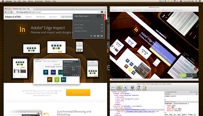
Adobe Edge Inspect is a lightweight web development utility tool that helps designers and developers preview designs on multiple mobile devices at the same time. It is available to Windows and Mac users, as long as you are using Chrome. Unlike native apps that are built with programming languages like Xcode and Objective C, Shadow targets the Web as a platform, so anyone who is coding in HTML 5, CSS, and JavaScript can take advantage of Shadow.
Why You Would Use This: Perhaps Bruce Bowman, senior product manager of Adobe's digital media business, says it best:
"As a Web developer, the more I can keep my eyes on my own screen and my hands on my own mouse, and not have to touch other devices, the more efficient I can be"
The real benefit of using Edge Inspect CC is that you can connect many mobile devices to your desktop and make edits on the fly to testing pages. Then, simply refresh Chrome on those edited pages and each of your connected and synchronized devices will update their screens on the fly to the new web page.
CONNECTING DEVICES TO COMPUTER
Auto-Discovery - The device running Edge Inspect will look for computers also running Edge Inspect. Tap the computer you would like to connect with. Enter the passcode into the Chrome Extension. This creates a wireless connection between your computer and device.
Manual Connection - If you can't find the computer you want to connect to, tap the "+" button to perform a Manual Connect. A list of IP Addresses associated with your computer is located at the bottom of the Chrome Extension. Insert the IP Address into the text field on the device.
When a device is connected, Edge Inspect will prevent the screen from dimming or going to sleep.
GOOGLE'S FRIENDLY TEST
Last, but certainly not least, is Google's very own mobile-friendly test. Of course, this is completely free, but the tester isn't without its flaws at this point that stem from the tool fetching pages as a Googlebot sees them, as opposed to how a human will see them. This means that some of the other tools, like Page Speed Insights, can give you a false positive. For example, if you were to test a page on Page Speed Insights first, it may say your page is good-to-go for mobile, while the mobile-friendly test doesn't. Likewise, if you use Google Webmaster Tools to "Fetch as Google" you may experience a similar result.
With that said, the mobile-friendly test is what will ultimately determine whether or not your web page is shown in search on Google as "Mobile-Friendly." It is important to note that each page must be tested individually. Entering only your home page URL or domain name will only yield results for that page and not the website as a whole. The same will apply for search results. Just because one page on your website isn't mobile friendly, doesn't mean your whole website will lack the "Mobile Friendly" tag. It will just be that one page if, in fact, other pages are mobile-optimized.
Why You Would Use This: Because it's Google, that's why. Seriously though, it is because this is ultimately the only one that matters when it comes to websites on mobile.
CONCLUSION
These mobile usability testing tools are some of the best out there that you can get for free, or at least try for free. Depending on your line of work and whether or not you're testing an app or website will determine which tool is best for you. At the very least, make sure that your website is considered "Mobile Friendly" by Google. But if you're serious about creating a positive user experience, then grab one of these tools and get out there and design the best mobile user experience you can.
Want more web design and usability insights? Check us out!


